Compose Boltuix App Template - Jetpack Compose 2025 UI Kit
Compose BoltUIX - App Template: The Ultimate Compose Material Design UI Toolkit
Our Mission: Empower Compose developers with a ready-to-use Material Design UIX template. Simplify the process of converting design concepts into cross-platform Compose code. Bring intuitive and innovative Material Design elements to your projects.
Compose Boltuix - App Template is a Kotlin-based UI library built entirely on Jetpack Compose, designed to accelerate the development of modern Android applications.
Overview
Compose Boltuix is a collection of pre-designed, customizable UI components and templates that adhere to Google's Material Design guidelines. It simplifies the process of creating responsive, visually stunning user interfaces, enabling faster time-to-market for high-quality Android applications.
Version: 1.1
Platform: Android (Jetpack Compose)
Release Date: 01/01/2025
Key Features
- Pre-designed Screens: 500+ screens across categories like media players, e-commerce layouts, dashboards, and more.
- Dark Mode Ready: All components include seamless light/dark theme support.
- Material Design 3 Support: Future-proof designs using the latest Material Design principles.
- Customizable Components: Modify colors, typography, and layout dimensions easily.
- Responsive Design: Adaptive layouts for devices of all sizes, including tablets and foldables.
Compose Boltuix - Project Configuration
Project Overview
- Project Name: Compose Boltuix Template
- Namespace: com.boltuix.composetemplate
- Last Updated: 01/01/2025
- Gradle Version: 8.9
Plugins Used
- Android Application Plugin (com.android.application)
- Kotlin Android Plugin (org.jetbrains.kotlin.android)
- Kotlin Compose Plugin (org.jetbrains.kotlin.plugin.compose)
- Dagger Hilt Plugin (com.google.dagger.hilt.android.plugin)
- KSP Plugin (com.google.devtools.ksp)
Android Configuration
- Namespace: com.boltuix.composetemplate
- Compile SDK: 35
- Minimum SDK: 24
- Target SDK: 35
Key Dependencies
- Jetpack Compose: UI Toolkit, Navigation, ConstraintLayout
- Material Design: Material 3 and core components
- Lottie Compose: Advanced animations
- Coil Compose: Image loading with SVG support
- ExoPlayer: Media playback
- Palette KTX: Dynamic theming
- Dagger Hilt: Dependency injection
Plugin Versions
- Android Gradle Plugin: 8.7.3
- Kotlin: 2.0.21
- Compose BOM: 2024.12.01
- Hilt: 2.54
- KSP: 2.0.20-1.0.25
Highlighted UI Component Demos
- App Bar Demo
Material Design app bar for navigation and actions at the top of the screen. - List Showcase
Scrollable list of items for organized content display. - Scaffold Demo
Basic layout using app bars and floating action buttons. - Snackbar Demo
Temporary messages at the bottom with optional actions. - Date Picker Demo
Dialog for selecting dates using a calendar interface. - Time Picker Demo
Dialog for selecting time using a clock or text input. - Shapeable Images Showcase
Images with customizable shapes like circles or custom paths. - Swipe to Refresh Demo
Pull-to-refresh functionality with smooth animations. - Swipe with Lottie Animation
Adds Lottie animations to swipe-to-refresh functionality. - Cards Showcase
Grouping content with Material Design cards. - Typography Showcase
Displays text styles like headlines, body, and captions. - Floating Action Button Demo
Variations such as small, large, and extended FABs. - Buttons Showcase
Demonstrates button styles like elevated, outlined, and text buttons. - Slider Demo
Implements sliders for selecting values or ranges. - Progress Indicator Showcase
Displays linear and circular progress indicators. - Menus Demo
Dropdown or contextual menu options with dynamic items. - Divider Demo
Adds dividers to separate content sections in a layout. - Dialog Showcase
Implements dialogs like alerts, custom dialogs, and bottom sheet dialogs. - Bottom Sheet Demo
Demonstrates bottom sheets with draggable or fixed configurations. - Badge Demo
Showcases badges for providing additional context like counts or statuses. - Text Field Showcase
Demonstrates text input fields with styles like floating labels and icons.
Specialty Navigation and Interaction Demos
- Navigation Drawer Showcase
Implements a navigation drawer for content access. - Navigation Rail Demo
Vertical navigation rails for compact screen layouts. - Navigation Bar Demo
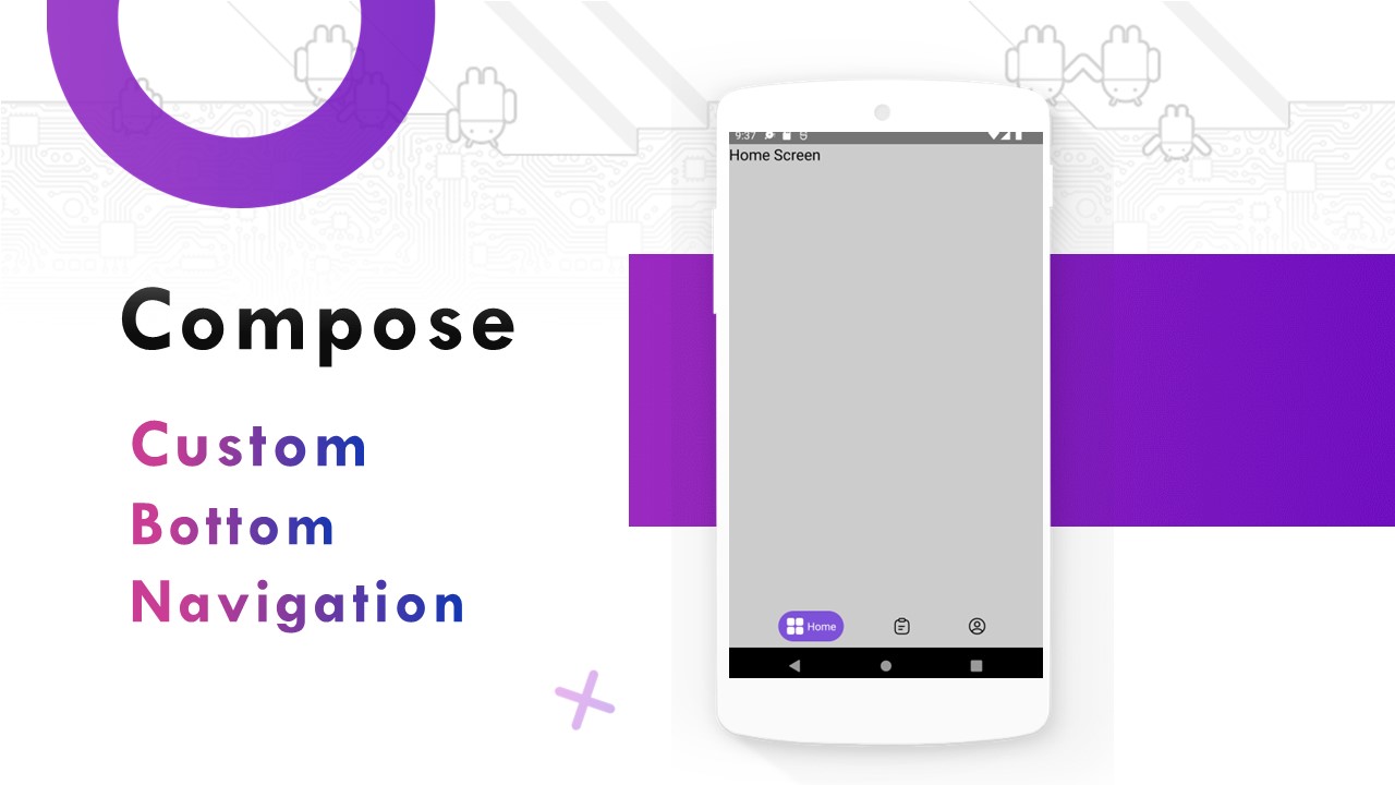
Bottom navigation bars with badges, labels, and dynamic items.
Advanced List and Grid Examples
- LazyColumn Demo
Efficient vertical scrolling list. - LazyRow Demo
Horizontal scrolling list. - LazyVerticalGrid Demo
Grid layout using LazyVerticalGrid.
Utility and Enhancement Demos
- Switch Demo
Toggle switches with customizable styles. - Radio Button Demo
Showcases radio buttons for selecting one option from a group. - Checkbox Demo
Multiple selections with customizable checkboxes.
Last Update: 2nd January 2025
# VERSION 1.2025.1
- Improved Animation Performance: Enhanced smoothness for transitions and animations.
- New Onboarding Styles: Added more templates for creative onboarding experiences.
- Bug Fixes: Addressed layout inconsistencies and performance issues.
Demo:
| Item Name | Compose Boltuix - App Template |
| Created by | Boltuix |
| Website | https://www.boltuix.com/ |
| Contact Email | boltuix@gmail.com |
| Created on | 01/1/2025 |
| Last Updated on | 1/1/2025 |


Comments
Post a Comment