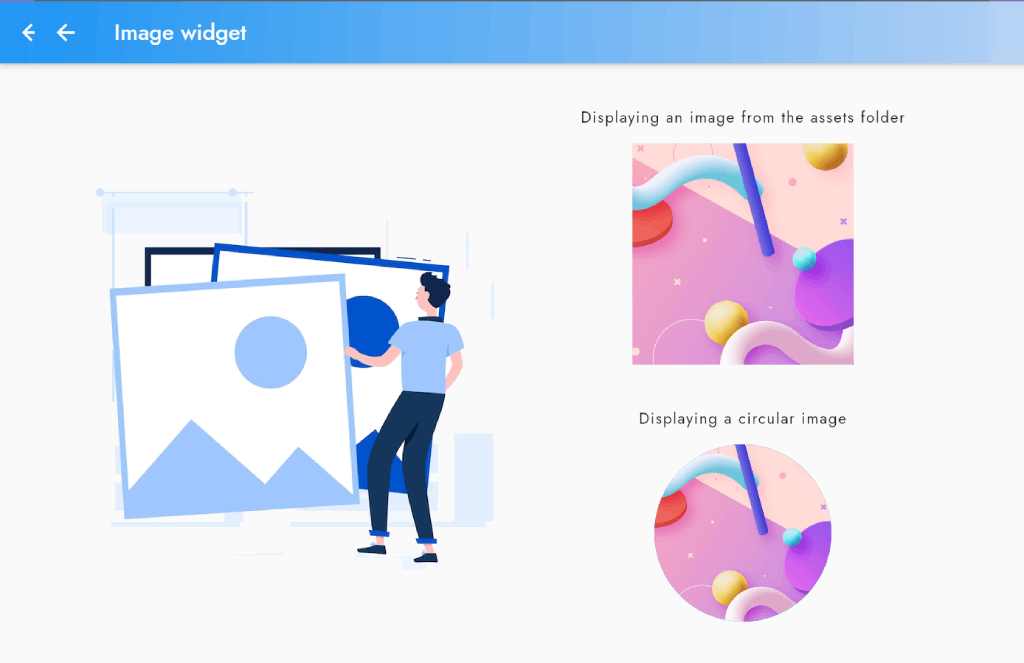
In this blog post, we'll explore various ways to display and style images in Flutter.
We'll cover how to display images from the assets folder, display circular and rounded rectangle images, add a placeholder image while the actual image is loading, and display a network image with a custom error widget.
By the end of this blog post, you'll have a better understanding of how to display and style images in your Flutter apps, and be able to create a variety of different image effects to make your app stand out.
Displaying an image from the assets folder:
If you want to display an image that is stored locally in your app, you can use the Image.asset widget. We'll explore how to do this and some related tips.
- Create an images folder in your assets directory. You can do this by right-clicking on the assets folder in your project directory and selecting "New Folder". Name the folder "images".
- Add the image you want to display to the images folder. You can do this by dragging and dropping the image file into the images folder in your project directory.
- Open your pubspec.yaml file and add the following lines to the flutter section:
  # To add assets to your application, add an assets section, like this:
  assets:
     - assets/images/
Image.asset(
                    'assets/images/logo.webp',
                    width: 200,
                    height: 200,
                    fit: BoxFit.cover,
                  ),
..
Displaying a circular image:
Circular images are a popular design choice in many apps. We'll show you how to create circular images in Flutter using the CircleAvatar widget.
const CircleAvatar(
                    backgroundImage: NetworkImage('https://raw.githubusercontent.com/BoltUIX/FlutterBlog/main/assets/images/bg.webp'),
                    radius: 80,
                  ),
Displaying a rounded rectangle image:
If you want to display an image with rounded corners, we'll show you how to do this using the ClipRRect widget.
ClipRRect(
                    borderRadius: BorderRadius.circular(10),
                    child: Image.network(
                      'https://raw.githubusercontent.com/BoltUIX/FlutterBlog/main/assets/images/bg.webp',
                      width: 250,
                      height: 250,
                      fit: BoxFit.cover,
                    ),
                  ),
..
Displaying a placeholder image while the actual image is loading:
To improve your app's user experience, you can display a placeholder image while the actual image is loading. We'll explore how to do this using the FadeInImage widget.
FadeInImage.assetNetwork(
                    placeholder: 'assets/images/logo.webp',
                    image: 'https://raw.githubusercontent.com/BoltUIX/FlutterBlog/main/assets/images/bg.webp',
                    width: 250,
                    height: 250,
                    fit: BoxFit.cover,
                  ),
..
Displaying a network image with a custom error widget:
If you're displaying images from a network source, you may encounter errors while loading the image. We'll show you how to display a custom error widget when this happens using the ErrorWidget class.
Image.network(
                    'https://raw.githubusercontent.com/BoltUIX/FlutterBlog/main/assets/images/bg.webp',
                    width: 250,
                    height: 250,
                    fit: BoxFit.cover,
                    errorBuilder: (context, error, stackTrace) {
                      return const Icon(Icons.error);
                    },
                  ),
..


