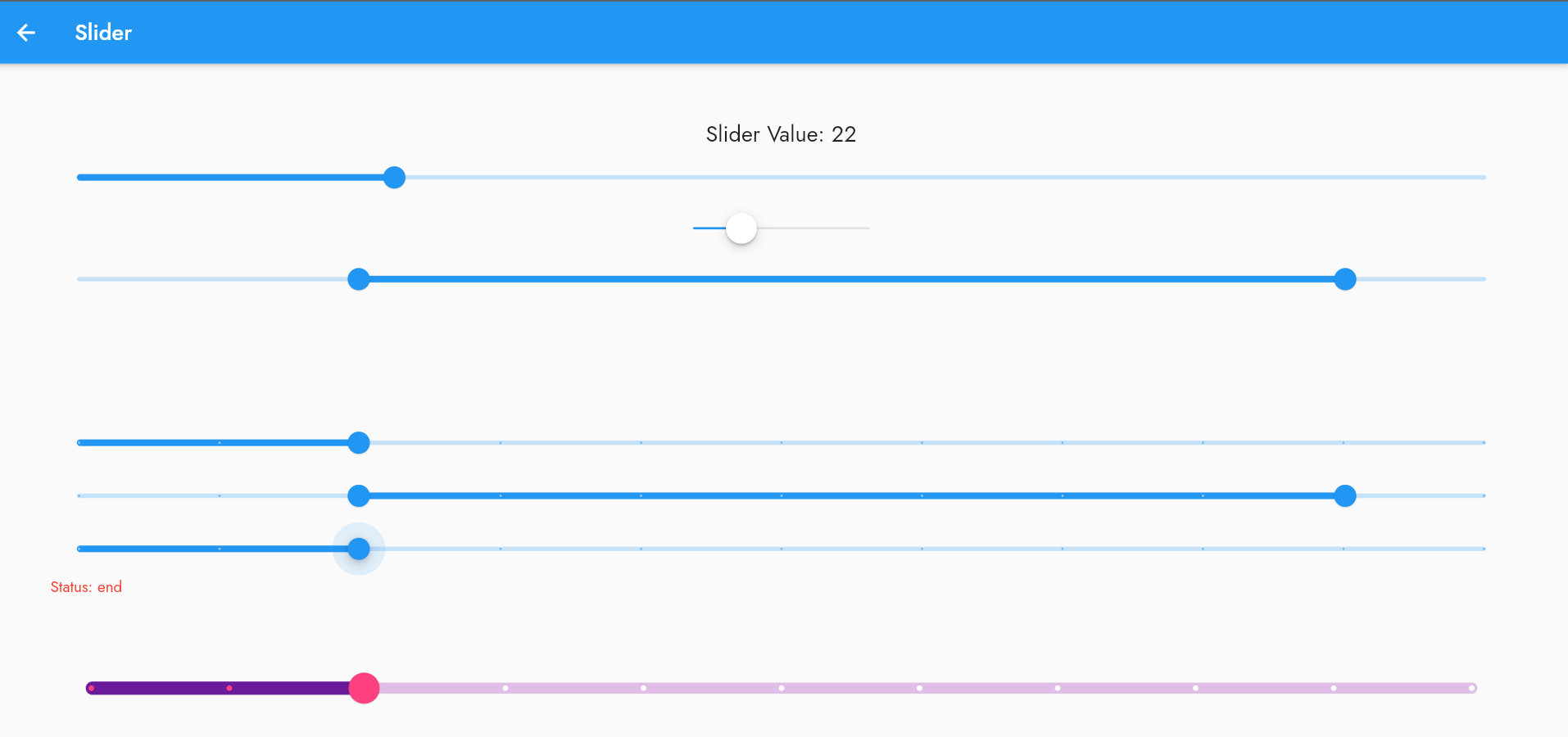
Learn how to use the Slider widget in Flutter, including code samples and its properties to customize its behavior and appearance.
These properties can be used to customize the appearance and behavior of the Slider widget to fit your application's needs.
Code Sample: Here is an example of a simple slider widget in Flutter:
double _currentSliderValue = 0;

Slider(
  value: _currentSliderValue,
  min: 0,
  max: 100,
  divisions: 10,
  label: _currentSliderValue.round().toString(),
  onChanged: (double value) {
    setState(() {
      _currentSliderValue = value;
    });
  },
)
..
This creates a horizontal slider with a range from 0 to 100 and 10 divisions. The label shows the current value of the slider, and the onChanged function updates the value when the user moves the slider.
Properties:
Here are some of the most commonly used properties of the Slider widget in Flutter:
- value: the current value of the slider.
- min: the minimum value of the slider.
- max: the maximum value of the slider.
- divisions: the number of discrete intervals that the slider can take on.
- label: the text that appears when the user interacts with the slider.
- onChanged: a callback function that is called whenever the user moves the slider.
- activeColor: the color of the slider track and thumb when it is in the active state.
- inactiveColor: the color of the slider track when it is in the inactive state.
- thumbColor: the color of the slider thumb.
- thumbShape: the shape of the slider thumb.
- trackShape: the shape of the slider track.
These properties can be used to customize the appearance and behavior of the Slider widget to fit your application's needs.
- Basic Slider: A simple slider that allows you to select a value within a range.
- Cupertino Slider: A slider with an iOS-style appearance.
- Range Slider: A slider that allows you to select a range of values within a range.
- Slider with Divisions: A slider that shows divisions and labels for easy value selection.
- Range Slider Divisions: A Range slider that shows divisions and labels for easy value selection.
- Slider with Status: A slider that displays its status as it's being interacted with.
- Custom Slider Theme: A slider with a custom appearance, including track shape, thumb shape, tick mark shape, value indicator shape, and colors.
import 'package:flutter/cupertino.dart';
import 'package:flutter/material.dart';

class SliderDemo extends StatefulWidget {
  const SliderDemo({super.key});

  @override
  SliderDemoState createState() => SliderDemoState();
}

class SliderDemoState extends State<SliderDemo> {
  double _value = 50.0;

  double _startValue = 20.0;
  double _endValue = 90.0;

  String _status = 'idle';
  Color _statusColor = Colors.amber;

  @override
  Widget build(BuildContext context) {
    return Scaffold(
      appBar: AppBar(
        title: const Text('Slider'),
      ),
      body: SingleChildScrollView(
        child: Center(
          child: Padding(
            padding: const EdgeInsets.all(50),
            child: Column(
              mainAxisAlignment: MainAxisAlignment.center,
              children: [
                Text(
                  'Slider Value: ${_value.toInt()}',
                  style: const TextStyle(fontSize: 20),
                ),

                // Basic Slider: A simple slider that allows you to select a value within a range.
                Slider(
                  min: 0.0,
                  max: 100.0,
                  value: _value,
                  onChanged: (value) {
                    setState(() {
                      _value = value;
                    });
                  },
                ),

                // Cupertino Slider: A slider with an iOS-style appearance.
                CupertinoSlider(
                  min: 0.0,
                  max: 100.0,
                  value: _value,
                  onChanged: (value) {
                    setState(() {
                      _value = value;
                    });
                  },
                ),

                // Range Slider: A slider that allows you to select a range of values within a range.
                RangeSlider(
                  min: 0.0,
                  max: 100.0,
                  values: RangeValues(_startValue, _endValue),
                  onChanged: (values) {
                    setState(() {
                      _startValue = values.start;
                      _endValue = values.end;
                    });
                  },
                ),
                const SizedBox(height: 100),

                // Slider with Divisions: A slider that shows divisions and labels for easy value selection.
                Slider(
                  min: 0.0,
                  max: 100.0,
                  value: _value,
                  divisions: 10,
                  label: '${_value.round()}',
                  onChanged: (value) {
                    setState(() {
                      _value = value;
                    });
                  },
                ),

                // Range Slider Divisions:  A Range slider that shows divisions and labels for easy value selection.
                RangeSlider(
                  min: 0.0,
                  max: 100.0,
                  divisions: 10,
                  labels: RangeLabels(
                    _startValue.round().toString(),
                    _endValue.round().toString(),
                  ),
                  values: RangeValues(_startValue, _endValue),
                  onChanged: (values) {
                    setState(() {
                      _startValue = values.start;
                      _endValue = values.end;
                    });
                  },
                ),

                // Slider with Status: A slider that displays its status as it's being interacted with.
                Column(
                  crossAxisAlignment: CrossAxisAlignment.start,
                  children: [
                    Slider(
                      min: 0.0,
                      max: 100.0,
                      value: _value,
                      divisions: 10,
                      onChanged: (value) {
                        setState(() {
                          _value = value;
                          _status = 'active (${_value.round()})';
                          _statusColor = Colors.green;
                        });
                      },
                      onChangeStart: (value) {
                        setState(() {
                          _status = 'start';
                          _statusColor = Colors.lightGreen;
                        });
                      },
                      onChangeEnd: (value) {
                        setState(() {
                          _status = 'end';
                          _statusColor = Colors.red;
                        });
                      },
                    ),
                    Text(
                      'Status: $_status',
                      style: TextStyle(color: _statusColor),
                    ),
                  ],
                ),
                const SizedBox(height: 50),

                // Custom Slider Theme: A slider with a custom appearance, including track shape, thumb shape, tick mark shape, value indicator shape, and colors.
                SliderTheme(
                  data: SliderTheme.of(context).copyWith(
                    trackHeight: 10.0,
                    trackShape: const RoundedRectSliderTrackShape(),
                    activeTrackColor: Colors.purple.shade800,
                    inactiveTrackColor: Colors.purple.shade100,
                    thumbShape: const RoundSliderThumbShape(
                      enabledThumbRadius: 14.0,
                      pressedElevation: 8.0,
                    ),
                    thumbColor: Colors.pinkAccent,
                    overlayColor: Colors.pink.withOpacity(0.2),
                    overlayShape:
                        const RoundSliderOverlayShape(overlayRadius: 32.0),
                    tickMarkShape: const RoundSliderTickMarkShape(),
                    activeTickMarkColor: Colors.pinkAccent,
                    inactiveTickMarkColor: Colors.white,
                    valueIndicatorShape:
                        const PaddleSliderValueIndicatorShape(),
                    valueIndicatorColor: Colors.black,
                    valueIndicatorTextStyle: const TextStyle(
                      color: Colors.white,
                      fontSize: 20.0,
                    ),
                  ),
                  child: Slider(
                    min: 0.0,
                    max: 100.0,
                    value: _value,
                    divisions: 10,
                    label: '${_value.round()}',
                    onChanged: (value) {
                      setState(() {
                        _value = value;
                      });
                    },
                  ),
                ),
              ],
            ),
          ),
        ),
      ),
    );
  }
}
..
Tags:
flutter

