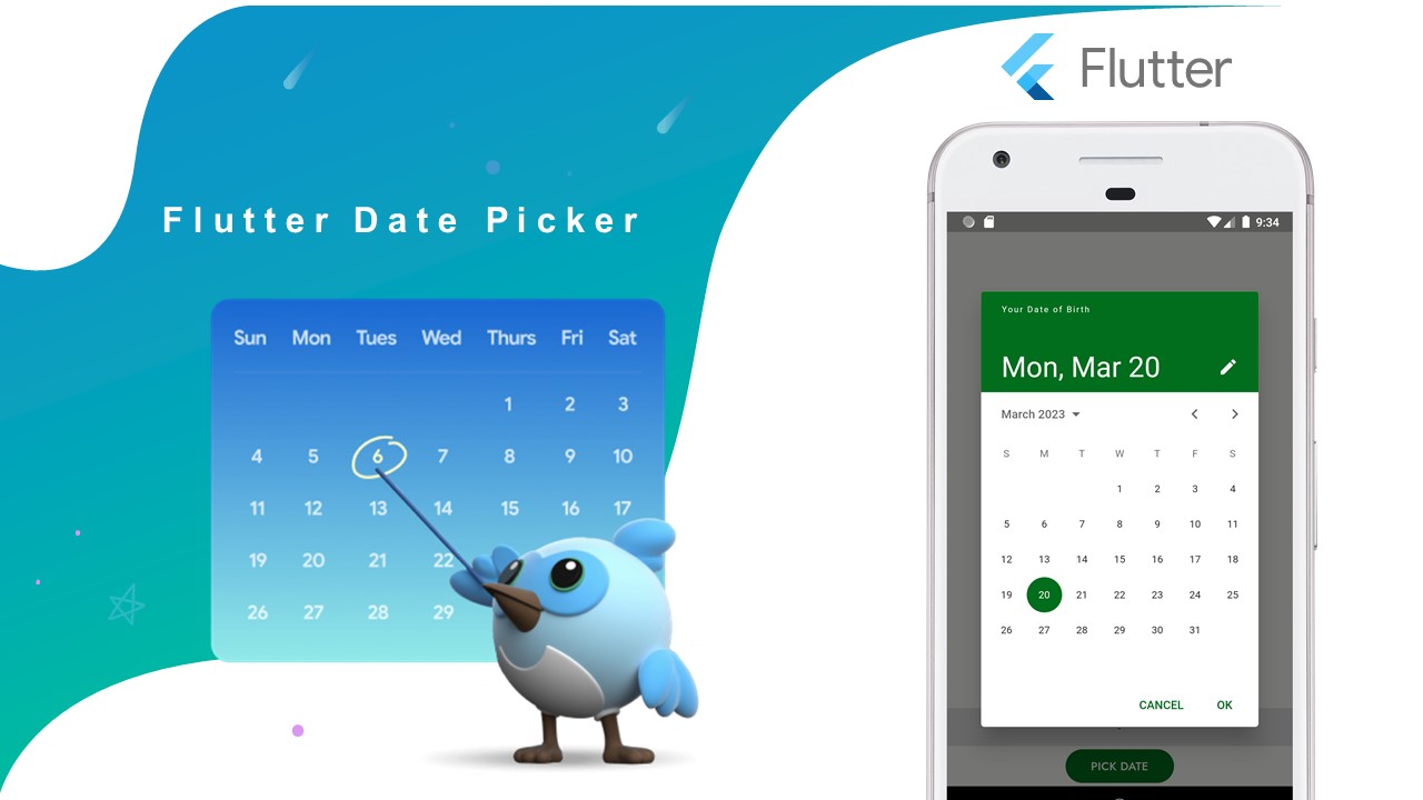
In this code example, you will see how to create a simple date picker widget using the Flutter framework. The code uses the showDatePicker() method to display a dialog that allows the user to select a date from a calendar.
Usage:
The date picker widget can be used in any Flutter application where the user needs to select a date. This could be for scheduling appointments, setting reminders, or any other use case where a date needs to be chosen.
Code:
import 'package:flutter/foundation.dart';
import 'package:flutter/material.dart';
import 'package:intl/intl.dart';

class PickerDateTimeRoute extends StatefulWidget {

  const PickerDateTimeRoute({super.key}); // Constructor for the widget

  @override
  PickerDateTimeRouteState createState() => PickerDateTimeRouteState(); // Creates the state for the widget
}


class PickerDateTimeRouteState extends State {

  late Future selectedDate; // The selected date, represented as a Future (may be null)
  String date = "-"; // The date to be displayed on the screen, initially set to "-"

  @override
  Widget build(BuildContext context) {
    return Scaffold(
      body: Column(
        children: [
          const Spacer(flex: 10), // A spacer widget to create some space between the top of the screen and the date display

          Container(
            alignment: Alignment.center,
            width: double.infinity,
            height: 45,
            color: Colors.grey[300],
            child:
            Text(date), // Displays the date on the screen
          ),

          Align(
            alignment: Alignment.center,
            child: ElevatedButton(
              style: ElevatedButton.styleFrom(
                  elevation: 0, backgroundColor: Theme.of(context).colorScheme.primary, // Sets the background color of the button to the primary color of the current theme
                  shape: RoundedRectangleBorder(borderRadius: BorderRadius.circular(20)),
                  padding: const EdgeInsets.symmetric(horizontal: 30)
              ),
              child: const Text("PICK DATE", style: TextStyle(color: Colors.white)), // The text displayed on the button
              onPressed: (){
                showDialogPicker(context); // Shows the date picker dialog when the button is pressed
              },
            ),
          ),

        ],
      ),
    );
  }

  // Shows the date picker dialog
  void showDialogPicker(BuildContext context){
    selectedDate = showDatePicker(
      context: context,
      helpText: 'Your Date of Birth', // The help text displayed on the date picker dialog
      initialDate: DateTime.now(), // The initial date displayed on the date picker
      firstDate: DateTime(2000), // The earliest date that can be selected
      lastDate: DateTime(2050), // The latest date that can be selected
      builder: (BuildContext context, Widget? child) { // A builder function that allows customization of the appearance of the dialog
        return Theme(
          data: ThemeData.light().copyWith(
            colorScheme:  ColorScheme.light(
              primary: Theme.of(context).colorScheme.primary, // Sets the color of the "OK" button to the primary color of the current theme
              onPrimary: Colors.white, // Sets the color of the text on the "OK" button to white
              surface: Colors.white, // Sets the color of the dialog surface to white
              onSurface: Colors.black, // Sets the color of the text on the dialog surface to black
            ),
          ),
          child: child!,
        );
      },
    );
    selectedDate.then((value) { // Called when a date is selected
      setState(() { // Updates the state of the widget
        if(value == null) return; // If no date is selected, do nothing
        date = Utils.getFormattedDateSimple(value.millisecondsSinceEpoch); // Formats the selected date as a string and sets it as the date to be displayed on the screen
      });
    }, onError: (error) { // Called if an error occurs
      if (kDebugMode) { // Only prints the error in debug mode
        print(error);
      }
    });
  }
}

// Helper class
class Utils {
  static String getFormattedDateSimple(int time) {
    DateFormat newFormat = DateFormat("MMMM dd, yyyy");
    return newFormat.format(DateTime.fromMillisecondsSinceEpoch(time));
  }
}
..
Properties:
- selectedDate: A Future variable that stores the selected date.
- date: A String variable that stores the formatted date to be displayed in the UI.
- showDialogPicker: A function that displays the calendar dialog to pick a date.
- BuildContext: A parameter that provides access to the current context in the widget tree.
- context.colorScheme.primary: The primary color of the current theme.
- initialDate: The initial date to display in the calendar dialog.
- firstDate: The first allowable date that can be picked.
- lastDate: The last allowable date that can be picked.
- builder: A function that specifies the appearance of the dialog.
- child: The child widget that is wrapped by the dialog.
- ThemeData: The data that defines the overall theme of the app.
..
Flutter Widgets,
Tags:
flutter

