Creating an App Walkthrough or Onboarding with SwiftUI 4.0
This tutorial will guide you through the process of creating a stylish onboarding screen or app walkthrough screens using SwiftUI 4.0.
The onboarding screen is typically the first screen a user sees when launching a new app, and it’s an excellent opportunity to show users what your app is all about and guide them through the initial setup process. With SwiftUI 4.0, creating an onboarding screen has never been easier, thanks to the new features like improved animation, dynamic loading, and a host of new views and modifiers that make it easy to create beautiful, interactive interfaces.
This tutorial will walk you through all the steps, from designing the interface to implementing the code and customizing it to fit your app's unique needs.
By the end of this tutorial, you'll have a working onboarding screen that you can integrate into your app, complete with smooth animations and interactive elements that will keep your users engaged and excited to explore your app.
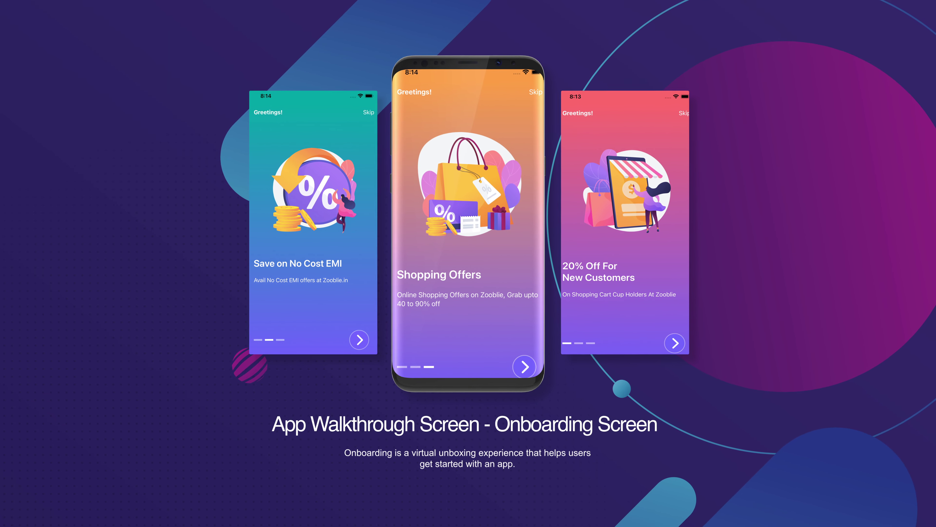
Onboarding is a virtual unboxing experience that helps users get started with an app.
Swift UI 4.0 code snippets for the IOS app developers:
ContentView.swift
//
//  ContentView.swift
//  Onboarding
//
//  Created by BoltUIX.COM on 16/08/22.
//

import SwiftUI

var totalViews = 3

struct ContentView: View {
    @AppStorage("currentView") var currentView = 1

    var body: some View {

        if currentView == 1 {
            WalkthroughScreen(
                title: "20% Off For New Customers",
                description: "On Shopping Cart Cup Holders At Zooblie",
                bgColor: "PastelColor",
                img: "intro_1"
            )
                .transition(.opacity)
        } else if currentView == 2 {
            WalkthroughScreen(
                title: "Save on No Cost EMI",
                description: "Avail No Cost EMI offers at Zooblie.in",
                bgColor: "VilvetColor",
                img: "intro_2"
            )
        } else if currentView == 3 {
            WalkthroughScreen(
                title: "Shopping Offers",
                description: "Online Shopping Offers on Zooblie, Grab upto 40 to 90% off",
                bgColor: "OrangeColor",
                img: "intro_3"
            )
        }


        if currentView == 4 {
            Home()
        }

    }
}

struct ContentView_Previews: PreviewProvider {
    static var previews: some View {
        ContentView()
    }
}


struct Home: View {
    var body: some View {
        Text("Welcome to Swift UI 4.0!!")
            .font(.title)
            .padding()
    }
}


struct WalkthroughScreen: View {

    @AppStorage("currentView") var currentView = 1

    var title: String
    var description: String
    var bgColor: String
    var img: String

    var body: some View {
        ZStack{
            VStack{
                HStack {
                    Text("Greetings!")
                        .foregroundColor(Color.white)
                        .accessibilityLabel("Greetings!")
                        .fontWeight(.bold)
                    Spacer()
                    Button(
                        action:{
                            currentView = 4
                        },
                        label: {
                            Text("Skip")
                                .foregroundColor(Color.white)
                        }
                    )
                }.padding()
                Spacer()
                VStack(alignment: .leading){
                    Image(img)
                        .resizable()
                        .aspectRatio(contentMode: .fit)
                        .padding()
                    Text(title)
                        .fontWeight(.semibold)
                        .foregroundColor(Color.white)
                        .font(.title)
                        .padding(.top)


                    Text(description)
                        .padding(.top, 5.0)
                        .foregroundColor(Color.white)
                    Spacer(minLength: 0)
                }
                .padding()
                .overlay(
                    HStack{

                        if currentView == 1 {
                            ContainerRelativeShape()
                                .foregroundColor(.white)
                                .frame(width: 25, height: 5)
                        } else {
                            ContainerRelativeShape()
                                .foregroundColor(.white.opacity(0.5))
                                .frame(width: 25, height: 5)
                        }

                        if currentView == 2 {
                            ContainerRelativeShape()
                                .foregroundColor(.white)
                                .frame(width: 25, height: 5)
                        } else {
                            ContainerRelativeShape()
                                .foregroundColor(.white.opacity(0.5))
                                .frame(width: 25, height: 5)
                        }

                        if currentView == 3 {
                            ContainerRelativeShape()
                                .foregroundColor(.white)
                                .frame(width: 25, height: 5)
                        } else {
                            ContainerRelativeShape()
                                .foregroundColor(.white.opacity(0.5))
                                .frame(width: 25, height: 5)
                        }

                        Spacer()
                        Button(
                            action:{
                                withAnimation(.easeOut) {
                                    if currentView <= totalViews || currentView == 2 {
                                        currentView += 1
                                    } else if currentView == 3 {
                                        currentView = 1
                                    }
                                }
                            },
                            label: {
                                Image(systemName: "chevron.right")
                                    .foregroundColor(Color.white)
                                    .font(.system(size: 35.0, weight: .semibold))
                                    .frame(width: 55, height: 55)
                                    .background(Color("BgNextBtn"))
                                    .clipShape(Circle())
                                    .padding(17)
                                    .overlay(
                                        ZStack{
                                            Circle()
                                                .stroke(Color.white.opacity(0.4), lineWidth: 2)
                                                .padding()
                                                .foregroundColor(Color.white)
                                        }
                                    )
                            }
                        )
                    }
                        .padding()
                    ,alignment: .bottomTrailing
                )
            }
        }
        //.background(Color(bgColor).ignoresSafeArea())
        .background(
                       LinearGradient(colors: [
                           Color(bgColor),Color("BgNextBtn")]
                                      ,startPoint: .top, endPoint: .bottom)
                   )
    }
}
Above code have three views: ContentView, WalkthroughScreen, and Home.
The ContentView view is responsible for handling the logic to switch between the onboarding screens and the home screen. It uses the currentView property that is stored in the app storage to keep track of the current screen. If the currentView is 1, it displays the first onboarding screen defined by the WalkthroughScreen view with a transition animation. If the currentView is 2 or 3, it displays the corresponding onboarding screens defined by the WalkthroughScreen view. If the currentView is 4, it displays the Home view.
The WalkthroughScreen view is responsible for rendering each of the onboarding screens. It takes four parameters: title, description, bgColor, and img. These parameters define the text and images that are displayed on the onboarding screen.
The view uses a ZStack to place the elements on top of each other. It defines a VStack to arrange the elements in a vertical stack. The title, description, and an image are displayed in the VStack. A "Skip" button is displayed on the top right corner of the screen. A "Next" button is displayed on the bottom right corner of the screen, which is used to switch to the next onboarding screen or the home screen.
The Home view is a simple view that displays a welcome message.
The code also defines a totalViews variable that is used to keep track of the total number of onboarding screens.
This variable is used to loop back to the first onboarding screen when the last screen is reached. Overall, the code provides a basic implementation of an onboarding screen using SwiftUI 4.0 that can be customized according to specific requirements.
..
GET source code on Github:


Comments
Post a Comment