Bottom Navigation Bar in Android Jetpack Compose
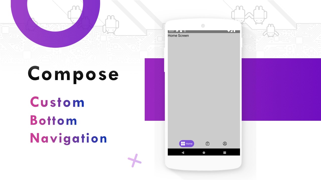
In this article, we will learn how to add bottom navigation in Jetpack Compose. Below is a sample of how it will look.
Why do we need a Bottom Navigation Bar?
- It allows the user to switch to different activities/fragments easily.
- It makes the user aware of the different screens available in the app.
- The user is able to check which screen are they on at the moment.
Adding Dependencies
Open build.gradle(app) and add the following dependency.
implementation 'androidx.navigation:navigation-compose:2.5.2'..
Creating Screens
Create three screens, Home, Report, Profile.
HomeScreen.kt (Create similarly report & profile pages)
package compose.material.theme.screens

import androidx.compose.foundation.background
import androidx.compose.foundation.layout.Column
import androidx.compose.foundation.layout.fillMaxSize
import androidx.compose.material.Text
import androidx.compose.runtime.Composable
import androidx.compose.ui.Modifier
import androidx.compose.ui.graphics.Color
import androidx.compose.ui.unit.sp

@Composable
fun HomeScreen() {

    Column(
        modifier = Modifier.fillMaxSize()
            .background(Color.LightGray)
    ) {
        Text(text = "Home Screen", fontSize = 20.sp)
    }

}
..
Create Bottom nav items
Let’s create a data class to hold data related to bottom nav items like label, icon, route. Create new file BottomBarScreen.kt and add the following code.
package compose.material.theme.bottomnav

import compose.material.theme.R


sealed class BottomBarScreen(
    val route: String,
    val title: String,
    val icon: Int,
    val icon_focused: Int
) {

    // for home
    object Home: BottomBarScreen(
        route = "home",
        title = "Home",
        icon = R.drawable.ic_bottom_home,
        icon_focused = R.drawable.ic_bottom_home_focused
    )

    // for report
    object Report: BottomBarScreen(
        route = "report",
        title = "Report",
        icon = R.drawable.ic_bottom_report,
        icon_focused = R.drawable.ic_bottom_report_focused
    )

    // for report
    object Profile: BottomBarScreen(
        route = "profile",
        title = "Profile",
        icon = R.drawable.ic_bottom_profile,
        icon_focused = R.drawable.ic_bottom_profile_focused
    )

}
..
Working with Navigation Components
Create a function with the name BottomNavGraph which will contain NavHost and the Composable for navigation. Refer to the comments in the code for a better understanding
package compose.material.theme.bottomnav

import androidx.compose.runtime.Composable
import androidx.navigation.NavHostController
import androidx.navigation.compose.NavHost
import androidx.navigation.compose.composable
import compose.material.theme.screens.HomeScreen
import compose.material.theme.screens.ProfileScreen
import compose.material.theme.screens.ReportScreen

@Composable
fun BottomNavGraph(
    navController: NavHostController
) {
    NavHost(
        navController = navController,
        startDestination = BottomBarScreen.Home.route
    ) {
        composable(route = BottomBarScreen.Home.route) {
            HomeScreen()
        }
        composable(route = BottomBarScreen.Report.route) {
            ReportScreen()
        }
        composable(route = BottomBarScreen.Profile.route) {
            ProfileScreen()
        }
    }
}
..
Adding Bottom Navigation
Refer to comments for better understanding. Putting everything together in Scaffold
package compose.material.theme.bottomnav

import androidx.compose.animation.AnimatedVisibility
import androidx.compose.foundation.background
import androidx.compose.foundation.clickable
import androidx.compose.foundation.layout.*
import androidx.compose.foundation.shape.CircleShape
import androidx.compose.material.Icon
import androidx.compose.material.Scaffold
import androidx.compose.material.Text
import androidx.compose.material3.MaterialTheme
import androidx.compose.runtime.Composable
import androidx.compose.runtime.getValue
import androidx.compose.ui.Alignment
import androidx.compose.ui.Modifier
import androidx.compose.ui.draw.clip
import androidx.compose.ui.graphics.Color
import androidx.compose.ui.res.painterResource
import androidx.compose.ui.tooling.preview.Preview
import androidx.compose.ui.unit.dp
import androidx.navigation.NavDestination
import androidx.navigation.NavDestination.Companion.hierarchy
import androidx.navigation.NavGraph.Companion.findStartDestination
import androidx.navigation.NavHostController
import androidx.navigation.compose.currentBackStackEntryAsState
import androidx.navigation.compose.rememberNavController

@Composable
fun BottomNav() {
    val navController = rememberNavController()

    Scaffold(
        bottomBar = { BottomBar(navController = navController) }
    ) {
        Modifier.padding(it)
        BottomNavGraph(
            navController = navController
        )
    }
}

@Composable
fun BottomBar(navController: NavHostController) {
    val screens = listOf(
        BottomBarScreen.Home,
        BottomBarScreen.Report,
        BottomBarScreen.Profile
    )

    val navStackBackEntry by navController.currentBackStackEntryAsState()
    val currentDestination = navStackBackEntry?.destination

    Row(
        modifier = Modifier
            .padding(start = 10.dp, end = 10.dp, top = 8.dp, bottom = 8.dp)
            .background(Color.Transparent)
            .fillMaxWidth(),
        horizontalArrangement = Arrangement.SpaceEvenly,
        verticalAlignment = Alignment.CenterVertically
    ) {
        screens.forEach { screen ->
            AddItem(
                screen = screen,
                currentDestination = currentDestination,
                navController = navController
            )
        }
    }

}

@Composable
fun RowScope.AddItem(
    screen: BottomBarScreen,
    currentDestination: NavDestination?,
    navController: NavHostController
) {
    val selected = currentDestination?.hierarchy?.any { it.route == screen.route } == true

    val background =
        if (selected) MaterialTheme.colorScheme.primary.copy(alpha = 0.6f) else Color.Transparent

    val contentColor =
        if (selected) Color.White else Color.Black

    Box(
        modifier = Modifier
            .height(40.dp)
            .clip(CircleShape)
            .background(background)
            .clickable(onClick = {
                navController.navigate(screen.route) {
                    popUpTo(navController.graph.findStartDestination().id)
                    launchSingleTop = true
                }
            })
    ) {
        Row(
            modifier = Modifier
                .padding(start = 10.dp, end = 10.dp, top = 8.dp, bottom = 8.dp),
            verticalAlignment = Alignment.CenterVertically,
            horizontalArrangement = Arrangement.spacedBy(4.dp)
        ) {
            Icon(
                painter = painterResource(id = if (selected) screen.icon_focused else screen.icon),
                contentDescription = "icon",
                tint = contentColor
            )
            AnimatedVisibility(visible = selected) {
                Text(
                    text = screen.title,
                    color = contentColor
                )
            }
        }
    }
}

@Composable
@Preview
fun BottomNavPreview() {
    BottomNav()
}
..
BadgeBox
- A BadgeBox is used to decorate content with a badge that can contain dynamic information, such as the presence of a new notification or a number of pending requests. Badges can be icon only or contain short text.
- A common use case is to display a badge with bottom navigation items. For more information, see Bottom Navigation
- A simple icon with badge example looks like:
@OptIn(ExperimentalMaterialApi::class)
@Preview
@Composable
fun BadgeBoxDemo() {
    BottomNavigation {
        BottomNavigationItem(
            icon = {
                BadgedBox(badge = { Badge { Text("6") } }) {
                    Icon(
                        Icons.Filled.Favorite,
                        contentDescription = "Favorite"
                    )
                }

            },
            selected = false,
            onClick = {})
    }
}
GET source code on Github:


It will really useful to lot of people, thanks for sharing this wonderful article